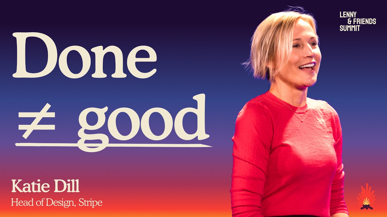
Raise the ceiling: how to scale intent, quality, and artistry with Al | Katie Dill (Stripe)
An unnamed Stripe designer, speaking at what appears to be an internal or industry talk, argues that the current 'AI building boom' risks repeating the mistake of post-war modernist architecture: fast, cheap building that thins into generic, uncared-for 'zombie' design unless creators bring intentionality back in. The claim rests mainly on personal anecdotes from the speaker's own work at Stripe (an ad crit, a design-system CLI called Kai, an opening animation iterated 56 times), plus a handful of named sources including Christopher Alexander, Nabil Qureshi, and John Ruskin, alongside some unsourced assertions about AI capability and productivity. The speaker offers four recommendations for building with AI without losing craft: have a point of view, encode your standards into the machine, refuse to confuse done with good, and unleash creativity and artistry.
Thesis: The AI building boom risks producing generic, uncared-for products, the digital equivalent of post-war 'zombie' architecture, unless builders act with intentionality. [04:22]
- Argument (~00:52): Post-WWII, modernist architecture was copied again and again without the founders' original intentionality, thinning into generic patterns ill-suited to context. [00:52]
- Argument (~01:12): Banks once signaled trust like the Rochester Savings Bank Building (1857) but became generic like the Macon-Atlanta State Bank (1935). [01:12]
- Unsourced claim (~01:51): We are in a new 'AI building boom' where teams of three can now do what teams of thirty used to. [01:51]
- Unsourced claim (~02:19): LLMs are good at giving the most probable, popular answer but less good at what's original or specific to a brand and user context. [02:19]
+ 42 more takeaways
- Anecdote (~02:44): An AI-generated website with no character could be mistaken for generic software but actually sells Korean barbecue. [02:44]
- Argument (~03:58): Because AI-made work is produced so quickly, it feels disposable and gets treated as disposable, raising the question of who maintains it long term. [03:58]
- Recommendation 1 (~05:38): Have a point of view, since AI will supply a generic one for you otherwise. [05:38]
- Anecdote (~06:23): At Stripe, the brand value of 'optimism' shapes colors, writing, and shipped products to support entrepreneurs. [06:23]
- Anecdote (~07:20): In a Stripe design crit on an AI-assisted ad, a cross-functional partner asked 'What's the quality standard for something made with AI?' [07:20]
- Unsourced claim (~07:34): The speaker concluded users only care whether AI-made output is good, not how it was made. [07:34]
- Anecdote (~07:42): The team's feedback round on the ad produced 17 bullet points of improvements. [07:42]
- Anecdote (~07:47): Feedback covered ice cube edges, cloudiness, cracking, bubble size, and amber tone to make carbonation and ice read realistically. [07:47]
- Anecdote (~07:56): The team coined the term 'Pepsi bubbling' as a verb for this meticulous craft. [07:56]
- Argument (~08:05): The goal is not perfection but going one level deeper than what the customer could consciously see. [08:05]
- Recommendation 2 (~09:00): Encode your standards into the machine, since humans won't be part of every decision going forward. [09:00]
- Argument (~09:32): Design systems are having a moment again because interfaces are now built without a designer in the room, requiring decisions to be written down. [09:32]
- Argument (~09:56): The speaker says the object of design is no longer the screen but the system itself. [09:56]
- Sourced claim (~10:02): Gutenberg is credited with the first printing press, but the lesser-known achievement was the system he built around it. [10:02]
- Sourced claim (~10:17): Gutenberg created 290 unique characters, including different widths, abbreviations, and ligatures, so justified text wouldn't have odd rivers of white space. [10:17]
- Anecdote (~10:38): The speaker's team built a system meant to be both extensible and opinionated enough to feel handmade despite being machine-made. [10:38]
- Argument (~10:50): The old system scaled consistency; the new system needs to scale intent. [10:50]
- Anecdote (~11:11): Stripe first built an MCP that understood their design documentation, but results weren't specific enough and three people entering the same prompt got three different results. [11:11]
- Anecdote (~11:27): They evolved to a CLI called Kai, built on their design system, which acts as a harness making the AI more obedient. [11:27]
- Anecdote (~11:36): The Kai CLI's generate command references specific components like a DateRangePicker from the @sail/ui package with props like timeZone and aria-label. [11:36]
- Recommendation 3 (~12:25): Refuse to confuse done with good, because the quality filter that used to be built into every stage of the process is now gone. [12:25]
- Sourced claim (~12:15): Christopher Alexander is quoted: 'A system can satisfy every rule and still be dead.' [12:15]
- Anecdote (~12:41): The speaker says they used to have 20 ideas but could only staff one, so products grew through poking, prodding, and pruning; now they can build 20 ideas in a week. [12:41]
- Argument (~13:06): Filtering used to happen throughout the process but now must happen post-build, when it's harder to say no, making the editor role newly critical. [13:06]
- Argument (~13:30): Organizations must unlearn the idea that built means done and done means good; editors must experience the product like a user would. [13:30]
- Sourced claim (~14:15): The speaker cites an article by Nabil Qureshi, published May 2, 2026, on what makes art great, referencing unexpected details and continuous themes that AI currently lacks. [14:15]
- Sourced claim (~14:45): Quoting Nabil Qureshi, AI 'slop' offends because details don't matter, e.g. 'the cup is green, but it may as well have been blue.' [14:45]
- Anecdote (~15:07): The team's Stefan created an opening 3D animation of a campsite scene, iterated roughly 56 times before it felt right. [15:07]
- Recommendation 4 (~16:32): Unleash creativity and artistry. [16:32]
- Argument (~16:53): Today's interfaces, chats, charts, and CLIs are not the epitome of great interactions in the modern era. [16:53]
- Prediction (no timeframe stated): Best practices for AI-era interfaces are yet to be defined; the speaker compares this moment to multi-touch or the synthesizer enabling new kinds of interaction. [17:29]
- Anecdote (no marker given in source): At Stripe, AI was used to amplify the creative team, including fine-tuning marbled book cover designs for 'Built to Grow' by Stephanie Friedman, originally created by a human marbler.
- Argument (no marker given in source): Two recommendations to make AI a stronger creative partner: improve inputs with specific prompts and source material, and stress outputs by pushing further and using adversarial agents to critique.
- Argument (~19:43): Leaders should give teams room to explore AI rather than just telling them to use it, and should 'protect the strange.' [19:43]
- Unsourced claim (~19:53): AI lowers the cost to create, and that savings should be spent on making something truly special rather than doing the same things faster. [19:53]
- Unsourced claim (~20:10): AI can help raise the ceiling, not just the floor, if used intentionally. [20:10]
- Recap (~20:16): The four principles given are have a point of view, encode your standards into the machine, refuse to confuse done with good, and unleash your creativity and artistry. [20:16]
- Sourced claim (~20:39): In 1850, John Ruskin wrote about craft, citing Gothic architecture as the epitome of great work because no building, and not even one column, was alike. [20:39]
- Argument (~21:04): Ruskin's point was that unique craftsmanship felt truly cared for, which is what users want from products today. [21:04]
- Argument (~21:10): Users aren't impressed by something animated quickly with Three.js and Blender; they're impressed by solving their problems and clever detail touches that show anticipated needs and brand character. [21:10]
- Argument (~21:28): The speaker frames the choice as either making the digital equivalent of zombie buildings or turning this AI building boom into a creative renaissance with products showing the hand and care of the maker. [21:28]
- Ask: not stated
A system can satisfy every rule and still be dead.
OVERALL: We still need to refine the parallelogram from the render a bit more. We adjusted it in Photoshop to get the right shape and updated the color to better match how a poured drink appears in their commercials. We're also fine-tuning the size, scale, and mix of bubbles so the carbonation reads more clearly.

Feedback
A. The edges feel too sharp and glass-like - they need more cloudiness and subtle cracking around the sides to read as real ice and some more depth to read as a cube.
B. The bubbles are a bit too large. Some are working, but add more smaller clusters for that freshly poured, carbonated look.
C. The edge of this cube could be straighter, and it should share some of the same edge qualities as the hero cube.
D. These should be smaller and more out of focus.
E. Same note as A - add a touch of cloudiness and some fine crackle details so it feels like ice not plastic.
F. Simplify this bubble cluster and push it further out of focus.
G. Match this cube's edge more closely to the hero it currently reads as a different shape.
H. This is getting closer for a background cube. Keep it out of focus, but bring in a bit of the clear hero edge to catch light subtly.
I. Remove the large bubble shapes behind the ice and replace them with smaller, more natural ones.
J. This area feels heavy introduce some of the amber tones to lighten it up just a bit.
K. Add a bit of light here to soften this dark patch.
L. Remove the two large bubbles and go smaller here as well.
M. Add a subtle cube edge here, similar to the treatment in H.
N. Soften this texture it's not quite reading as ice crackle yet; make it a bit more delicate.
O. Smooth this area slightly to reduce the heaviness and soften the inner texture.
P. Add just a hint of a cube edge here, similar to H.
Q. Soften this irregular shape and work in a few smaller, subtle bubbles.
generate [options] [prompt...]
"name":"DateRangePicker",
"metadata":{
  "id":"trh_doc_UtGVsopD4NYV17"
  "description":"A DateRangePicker allows users to select a single or a range of dates."
  "url":"https://trailhead.corp.stripe.com/docs/sail-ui/components/date-range-picker"
  "kind":"component"
  "import":"DateRangePicker",
  "package":"@sail/ui"
  "components":[
    "DateRangePickerTriggerButton"
    "DateRangePickerTriggerChip"
  "props":[
    "name":"timeZone *
    "type":"string"
    "description":The timezone to use for the date picker."
    "name":"aria-label"
    "type":"string"
    "description":"@see aria-labelledby."
    "name":"children"
    "type": "ReactNode"
"description": [...]How this brief was shaped: Trend Commentary / Opinion Essay · confidence Medium
The opening builds a thesis about generic AI-driven design replacing intentional design (Bauhaus vs zombie buildings), then the speaker gives four numbered recommendations for using AI with more care and soul. The OCR shows scattered brand/product mockups and design feedback notes, supporting the design-critique angle rather than a procedural how-to.
The lens sets this brief's structure, never its facts — every claim is held to the same citation and fact-check standard.