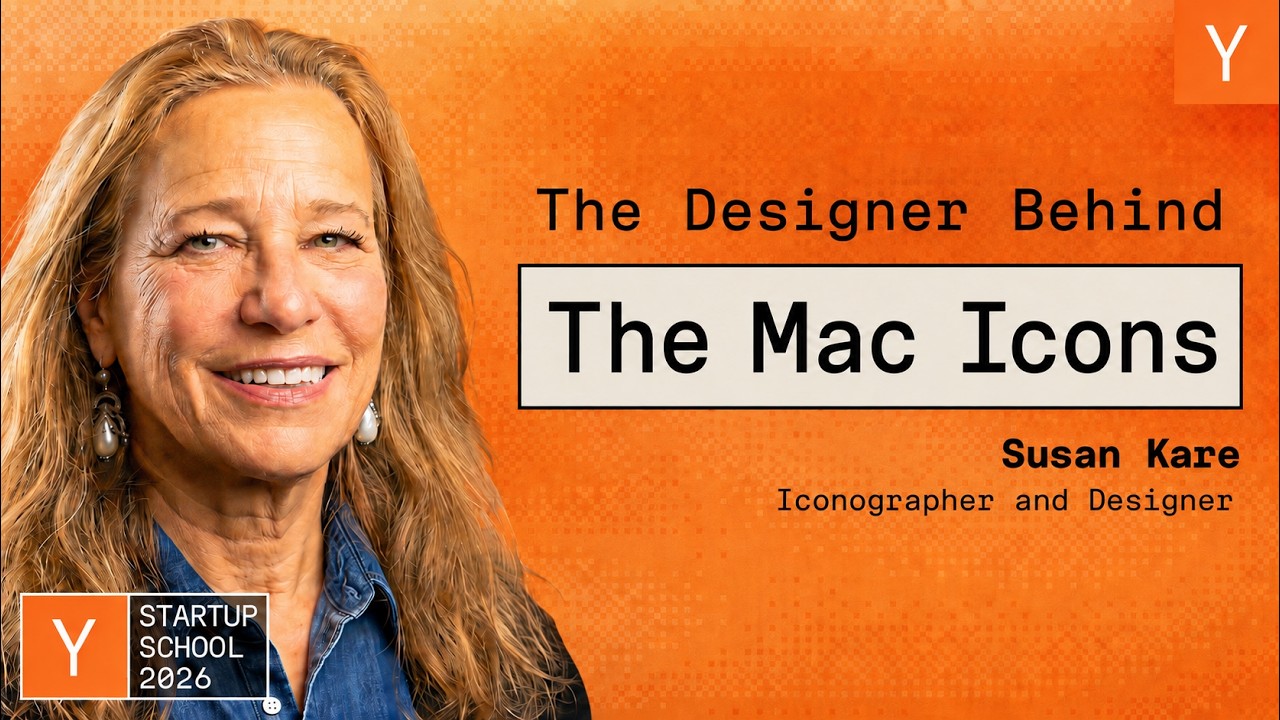
Susan Kare: How I Designed the Original Apple Mac Icons
This is a talk in which designer Susan Kare recounts her career, from earning a PhD in art history and doing sculpture and typography work to being recruited by her high school friend Andy Hertzfeld to design the original Macintosh's fonts, icons, and interface, including the Chicago font, the Happy Mac, the bomb icon for total system failure, and the command symbol. She narrates specific design decisions and philosophy, tells stories about mentors Paul Rand and Steve Jobs, then moves through later projects for Swatch, Microsoft Windows 3.0, General Magic, Facebook Gifts, Pinterest, and other companies. The talk closes with a run of advice and quotes from mentors and colleagues, including Alan Kay, Jobs, Andy Hertzfeld, her father Morley Kare, and Garry Tan, before she thanks Y Combinator for hosting the event. The arc is chronological, moving from her pre-Apple background through the Mac years to her later career, with no other stated turning point.
Susan Kare's stated North Star for the Mac group: 'Since computers are so smart, wouldn't it make more sense to teach computers about people, instead of teaching people about computers?'
- Paul Rand told her early on to always focus on making things meaningful and memorable, and that simplicity is not the goal but the product of a good idea and modest expectations
- She earned a PhD in art history from New York University in 1978, with a thesis on caricature in sculptures by Honore Daumier and Claes Oldenburg
- Before Apple she welded a life-size razorback hog for a museum in Arkansas and gained typographical experience using a photo typositor at Philadelphia's Franklin Institute Science Museum
- Her high school friend Andy Hertzfeld, a systems programmer at Apple, recruited her to design symbols and typefaces for a new computer that didn't yet have a case
+ 62 more takeaways
- Andy suggested she sketch sample icons on graph paper to mimic bitmap graphics, and some of those early random designs slightly influenced the final icons
- She got the job without being asked any font design questions, and her original interview sketch notebook is now in MoMA's permanent collection
- [05:45] On her first day at Apple she was shown a screen and told her job was to create typefaces and symbols to improve it, including turning the round-rects on a 5.25 inch floppy drawing into icons
- [05:44] The screen shown to her was titled 'THE FIRST DESIGN PROBLEM: CREATE A SET OF TYPEFACES AND SYMBOLS TO IMPROVE THIS SCREEN IMAGE'
- [06:29] The roundrects could become icons users could click and drag with a cursor, so she set out to make a new system font and icons
- [06:45] The stated goals for the Mac interface were that anyone could use it, like arcade games with no manuals, and that it should feel friendly
- [07:57] The screen constraints she designed within were 16 by 16 pixels, black and white
- [08:50] The first font she designed was Chicago, 9 pixels tall at cap height, built from horizontals, verticals, and 45 degree angles to look tidier than existing jagged screen fonts
- [09:26] The Macintosh could do proportionally spaced fonts, unlike earlier displays that squished or stretched letters like M and I to equal widths
- [10:05] Chicago font (1982) shipped with the Mac and was later used in the first iPod and the calculator; other shipped fonts included Monaco, New York, and Geneva
- [11:27] Steve Jobs suggested naming the fonts after 'world class cities' instead of local Philadelphia suburbs like Poli, Winwood, and Rosemont, resulting in the names New York and Geneva
- Andy wrote an icon editor with no drawing tools, just bit toggling, showing an enlarged image next to the actual 72 dpi icon size, and it automatically generated hex code that could be typed in to display the icon on screen
- She made 32x32 pixel portraits of people who sat for her, including Fel Williams and design leader John Miada, plus Ashton Kutcher, who did not actually sit for his
- [15:34] One of her first assigned icons was for the Mac boot screen, at 32x32 pixels on the 128K Macintosh, meant to reassure users everything was okay during the slow boot
- The Happy Mac smiley design likely came from her memory of a button she had around age 14
- Her 'Understanding Happy Mac' idea riffs on Scott McCloud's insight, from a comics book published 10 years after the Mac launched, that simpler, less detailed faces let more people project themselves onto them
- Her icon design bias was to include only one or two salient details without clutter, similar to the simple two-kids-holding-hands silhouette on school crossing signs
- She designed a 'sick'/hungover-looking Mac for system errors and a Bugs Bunny-style bomb icon for total system failure, meant to be irreverent since she thought no one would see them, but a real caller to Apple's software group worried her computer was going to explode after seeing the bomb icon
- [20:06] She designed the MacPaint icon first, pairing it with a resembling document icon so the application was like a verb and the document a noun
- [20:39] At the time there were only about half a dozen applications, so there was no expectation yet that there would eventually be thousands
- [20:44] For the Alerts icon she cropped a person down to just a square head so it revealed no gender, age, or hairdo
- [21:02] She made a watch cursor instead of an hourglass because she had only known sand timers as egg timers and wanted to update the reference for the 80s
- [21:22] The print icon showed the Image Writer's paper with sprocket holes in too much detail, which she called a 'trap' since a simpler design would have aged better
- [22:20] Steve Jobs told her 'You cannot do this,' calling the multiple Apple-logo menu items an 'Apple farm' since the logo was precious, and the Apple key idea was scrapped
- [23:16] She found an image in a library book labeled 'feature,' resembling a four-leaf clover or cloverleaf highway, easy to draw at 16x16, which became the command symbol still on keyboards today
- [24:51] A Swedish contact told her the same symbol appears on Swedish signs and originates from Borgholm Castle, circa 1200 AD, which looks like a four-turreted castle from above
- [27:04] She says she likes to think there were emojis in the 1984 Macintosh, combining pictures with text before texting existed
- [27:20] She says the icon system had a hieroglyphic antecedent, and she hid hieroglyphic-type symbols within it
- [27:37] She says the project was never really just about a grid of pixels, but about the metaphor, idea, and meaning behind everything
- [27:51] For Swatch she designed an alarm icon, starting with a clock and iterating to make it noisier, more literal, louder, and simpler
- [29:04] After Apple she did work for Microsoft on Windows 3.0, using a 16-color palette that included red for alerts
- [29:41] She created a dithered wallpaper using the same 16 colors to make them appear more subtle, avoiding a garish chessboard look
- [30:09] Slate.com described Windows Solitaire as 'the most-used program in the Windows universe'
- [31:01] For General Magic she designed the logo and UI graphics using a literal desktop metaphor of hallways, doors, and jars of text
- [32:10] Facebook Gifts didn't allow image uploads but let users buy images for a real dollar and send them to people
- [32:39] The Facebook Gifts program ran for almost four years, launching a new gift every day at midnight Eastern
- [33:22] She learned that 'cute trumped everything,' with teddy bears, heart shapes, and the kiss mark being the best seller of all time
- [33:44] She says if her life depended on selling a drawing for a dollar now she would draw a penguin, since multiple limited-edition penguin drawings all sold out
- [33:56] Facebook Gifts included collaborations with Britney Spears and other entertainers before Facebook ended the program to avoid competing with third parties
- [34:15] She later designed animated icons for Pinterest, a trash panda logo for stealth startup mill.com, an illustration for Amtrak's magazine 'The National,' a logo for Magic Puzzle, logo studies for the Pikmin Bloom game and Paradot, avatars, badges for a new Ledger crypto wallet, and a logo for VC firm Offline Ventures
- [37:43] Paul Rand told her 'You only need about five fonts, you just have to understand how to use them well,' and she later worked with him at NeXT after Steve Jobs left Apple
- [38:43] When Jobs wanted to invite five firms to design a logo for $15,000 each and pick the best, Paul Rand instead said he would charge $100,000 to do one logo that they would like, and that is what happened
- [39:23] Paul Rand tended to use fonts like Bodoni, Univers, Garamond, handwriting/handdrawn styles, and occasionally Futura and Helvetica, along with consistent colors like PMS 354 green
- [39:47] Paul Rand said, 'Black is the only good color for a car.'
- [39:56] Paul Rand advised, 'If you don't have a billion dollars to spend to get people to recognize your logo, then at least try to unite the name with an image that reinforces it.'
- [41:04] Paul Rand showed his UPS logo design to his six-year-old daughter Katherine, who said 'It's a present, Daddy,' referencing the shield and package in the design, which was later modernized
- [41:45] Futurist Paul Saffo said, 'Never mistake a clear view for a short distance.'
- [42:22] Her father, Morley Kare, director of Philadelphia's Monell Chemical Senses Center, was introduced to Paul Rand and had him design Monell's logo; Morley Kare advised, 'If you hear no try not to get depressed, you're going to hear a hundred no's, so now you're closer to yes,' and 'You can change your situation and have different problems, but you'll always have the same number of problems.'
- [45:09] Bud Tribble, quoting Alan Kay, said 'Simple things should be simple, complex things should be possible,' framed as a tenet about ease of use in the UI
- [45:35] Alan Kay told her, 'You could make those fonts because you didn't know you couldn't,' about proportionally spaced fonts
- [46:10] At the first Apple offsite, Steve Jobs posted three goals: real artists ship, it's better to be a pirate than join the navy, and Mac in a box by 1986
- [46:23] Because of the pirate goal, programmer Steve Capps and she made a pirate flag with a striped-apple eye patch and flew it from the roof at night
- [47:24] Steve Jobs told her not to buy her own Apple stock since he wasn't buying his, which she calls the worst advice she got from him
- [49:13] Andy Hertzfeld advised never presenting Steve Jobs with just one option since he'd say no, but showing a few lets him engage and pick one
- [49:40] Her mom's advice: 'If you can't find something, look under the bed.'
- [50:14] Dennis Hwang, who started at Google as a Stanford undergrad, said the number one rule was don't touch the logo, but Larry and Sergey are contrarians, leading to the Google Doodles
- [50:51] A slide shows an archival photo of three men at an outdoor gathering, the center figure resembling former President Ronald Reagan in a red-and-white checked shirt and bandana, flanked by a man in a cowboy hat and a man playing a black-and-white accordion branded 'Sonola'
- [50:58] She cites Garry Tan's advice: 'Learn, Earn, Or Quit.'
- [51:06] She clarifies this doesn't mean be discouraged and quit, but that it may be time to move on to the next idea
- [51:17] The talk's closing thanks name 'Susan' and kare.com
- [51:23] She thanks Y Combinator, saying the day ran smoothly and everyone was gracious
- [51:35] She says she felt envious of everyone else taking part in the event because it seemed so cool
SIMPLICITY IS NOT THE GOAL. IT IS THE PRODUCT OF A GOOD IDEA AND MODEST EXPECTATIONS. -PAUL RAND
SIMPLE THINGS SHOULD BE SIMPLE. COMPLEX THINGS SHOULD BE POSSIBLE. -BUD TRIBBLE QUOTING ALAN KAY
1. REAL ARTISTS SHIP 2. IT'S BETTER TO BE A PIRATE THAN JOIN THE NAVY 3. MAC IN A BOOK BY 1986 -STEVE JOBS
YOU ONLY NEED ABOUT FIVE FONTS. YOU JUST HAVE TO UNDERSTAND HOW TO USE THEM. -PAUL RAND
DON'T TOUCH THE LOGO. IT'S THE NUMBER ONE RULE. BUT LARRY AND SERGEI ARE CONTRARIANS. -DENNIS HWANG
How this brief was shaped: Narrative (vlog / gaming / travel / entertainment) · confidence Low
Susan Kare narrates her career at Apple in chronological order, from her art background through designing Macintosh icons and fonts with Andy Hertzfeld, with OCR showing her PhD thesis record and 1983 menu shortcuts as period artifacts along the timeline. There is no single contested thesis being argued and no course context, it reads as a personal history retold in order rather than an analytical case study.
The lens sets this brief's structure, never its facts — every claim is held to the same citation and fact-check standard.